
Just the facts, ma'am (and gents)
Just the facts, ma'am (and gents)
Lies, damn lies, and statistics

This just in… Tony Heller, crusader for truth, has put together a video illustrating that this vaccination push is causing the Rona to mutate and to spread more than it normally would if we had just let the disease run its normal course. Watch: LINK
While poking around on government websites, the other day, I noticed some interesting things. Among them, vaccination rates, hospitalization rates, and case rates not necessarily adding up… Or, at least, not making much sense.
My first chart shows Oregon’s “vaccination” rate. ( I put the word in quotes because there’s some debate over whether or not the mRNA shot is truly a vaccine.) They will have “fully vaccinated” nearly 3/4 of the state’s population by the end of 2021. Yet… something doesn’t seem right to me. First of all, let’s take a look at Oregon Health Authority’s graph showing the vax rate. Let’s pick a date for reference to another chart I will be posting later. I chose August 1, 2021 as a reference point. Note that, by this time, nearly 2/3 of the population was fully vaccinated. By end of year, 3/4 of the state’s population will be injected with this experimental drug.

Now, let’s look at the case rate data, also from Oregon’s OHA. Again, for reference purposes, let’s start again at August 1, 2021. Notice anything odd?

Kinda weird, isn’t it? “They” keep blaming the unvaxxed for spreading the virus even though, at this time, most people were vaxxed (let us not forget the fact that by the end of 2020 one in three Americans had already contracted the virus*)
Okay, now let’s contrast what we’re hearing from “officials” with the actual data. We keep hearing, over and over, that first, COVID-19, then, Delta, followed the Omicron variants are going to overwhelm our hospitals (scare tactics?). The following chart screenshots were taken just a few days ago, toward the end of December, 2021. First, from Oregon’s OHA website:

Note that the biggest spike EVER, in Oregon, occurred in September of 2021, where we see that there were over 1,100 “COVID-19 positive patients”. AFTER MOST HAD BEEN VACCINATED. Also note that, during this same period, there were over 300 “COVID-19 positive patients” in ICU’s throughout the state. Now, I would like for you to keep those numbers in mind as we look at the following two charts from the United States department of Health and Human Services. I would also ask you to remember that “officials” continue to warn us of hospitals being overwhelmed by COVID patients. Please bear in mind that “COVID-19 positive” doesn’t necessarily mean that’s what the patients are in for. The term has been used extensively by government and media to generate needless hysteria (more on that in another essay). Hospitals have a financial incentive to list patients as “COVID-19 positive” whether that’s what the patient is in for or not.
First, let’s look at Oregon’s hospital bed capacity and utilization, breaking down for “Inpatient beds”, “Inpatient beds in use”, and “Inpatient beds in use for COVID-19”:
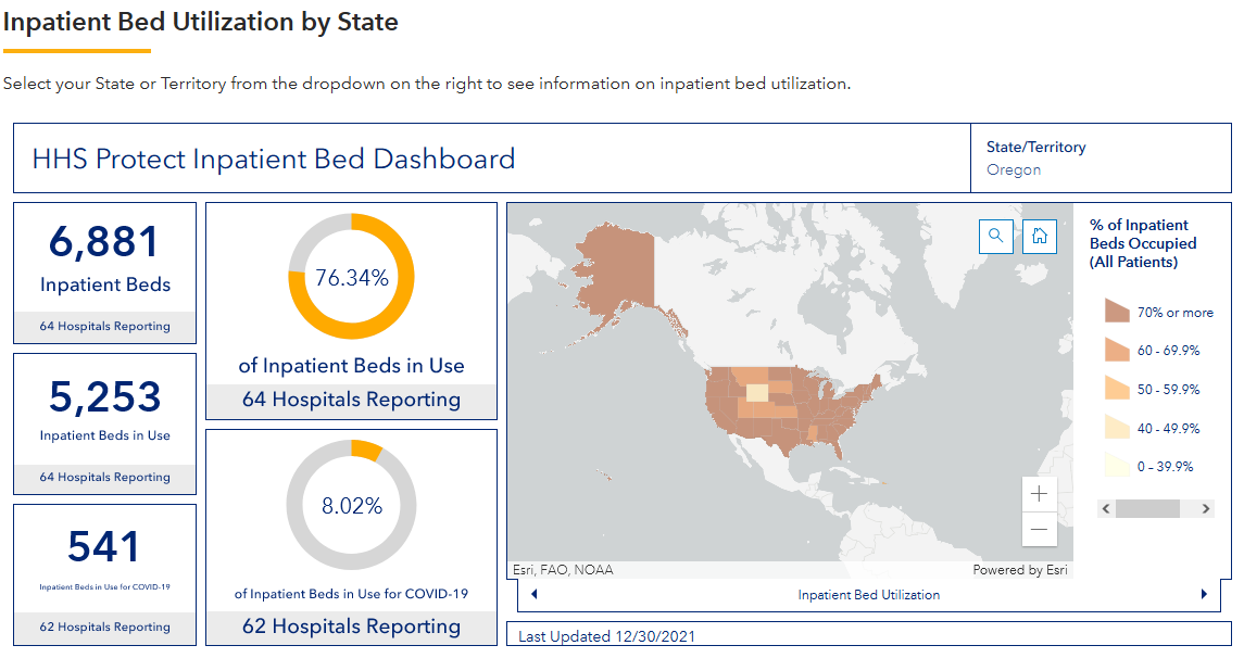
Remember that, in early September, there were just over 1,100 patients hospitalized with COVID-19? I don’t have a chart from HHS showing the utilization from that month, but we can extrapolate from this chart that 1,100 would not overwhelm Oregon hospitals with COVID-19 patients.
Now, let’s take a look at HHS’s ICU bed utilization numbers (again, taken recently):
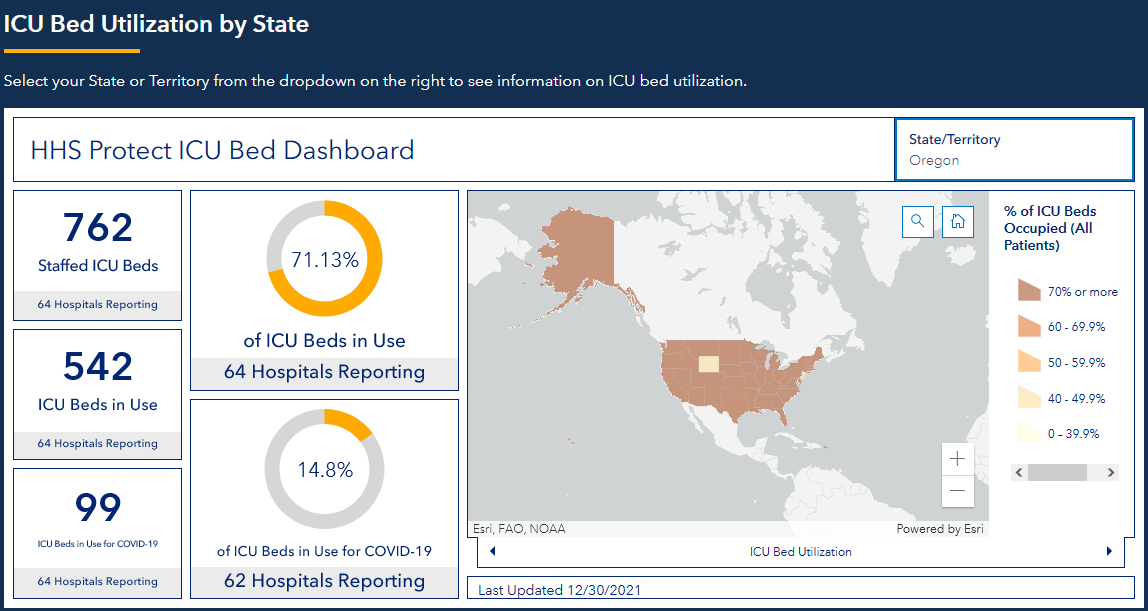
If we were to add the 300 that OHA said were in ICU with COVID-19 in September, we can see that the hospitals would be overwhelmed with ICU patients if the number of beds in use were the same as indicated by this chart. Unfortunately, we don’t have that information readily at hand.
I would also like to point out that in September of 2021, my co-workers wife, who works at a large hospital nearby, relayed information from an internal newsletter indicating that vaccinated patients in the hospital accounted for 89% of COVID-19 admissions. I recall trying to verify that information, but all I could find was information on capacity. Not a breakdown of vaxxed vs unvaxxed.
Please comment with suggestions to improve this newsletter. I confess to being a rank amateur when it comes to this sort of thing.
Thanks, Craig
*1 in 3 Americans contracted CoV
It's clearly seen by what we're told by the mainstream news that it's more important to project fear rather than to make available data to support reason to fear. As I've been discovering myself, data that should be made easy for the public to distinguish facts is grossly skewed and misleading the public. Instead, this "campaign to motivate vaccinations" is driven primarily by fear and nothing else. Sadly, I'm aware this fear driven campaign continues throughout the country even though I happen to know nurses (hospital workers) as well who verbally admit they see more vaccinated patients with problems in the hospitals than non - vaccinated. Thanks for the illustration of facts here that is critical to understand as I'm living here in Oregon myself in need of better information to share like this article.
"show’s" -- typo.....
Agree with "vaccination" .... but they've expanded the definition to include everything up to boosters.....
Almost all the cases vs time charts have the same pattern: peak, valley,peak, valley, ... not just US charts.....
Maybe if we could get a chart of # of people vaccinated by day, instead of cumulative, we might see something.
Calculating # beds per hospital from the "ICU beds utilization" slide (average per hospital):
Staffed ICU beds: 12
ICU beds in use: 8.5
ICU beds in use for CV: 1.5
Those numbers are not quite as horrifying as we're led to believe.